7 CSS features that kill !important
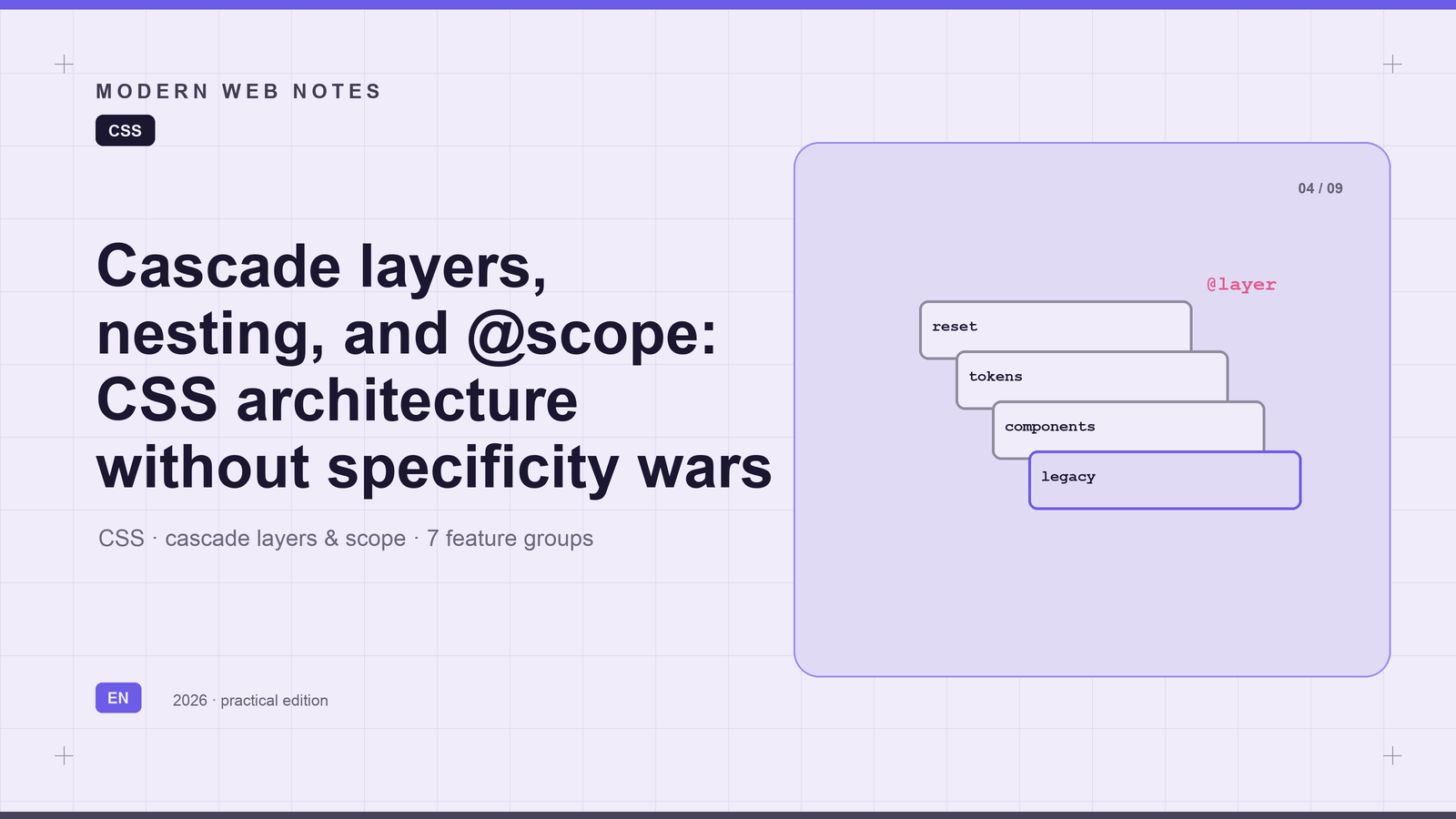
7 CSS features that kill !important for good (plus 8 more you probably missed)
Every product that makes it to year six has a stylesheet that looks like ours:
A reset copied from a 2016 boilerplate. A design system. Component styles from four different teams. A utilities file nobody owns. And page-overrides.css — because on the invoices page, one button has to be red.
When we finally looked inside, we found 14,000 lines and 380 !important declarations.
And we couldn't delete anything: the only way to know if a rule still mattered was to remove it and watch production for a week.
Here's the good news — you don't need a rewrite. Modern CSS lets you declare priority explicitly instead of fighting over selector weight.
The key insight everyone skips
The cascade doesn't sort declarations by specificity. It sorts them like this:
Origin → Importance → Layer → Specificity → Scope proximity → Order of appearance
Specificity is the third criterion, not the first. We've been fighting on the third rung of the ladder when the winning tools sit on the second.
Specificity is local: read a selector, know its weight. Layers are global: the winner is decided by one line at the top of the file.
One line sets the architecture of the entire bundle:
@layer reset, tokens, base, layout, components, utilities, overrides, legacy;Read it as a stack from weakest to strongest. Anything in legacy beats anything in components — no matter how monstrous the selector inside components is.
A low-specificity rule in a strong layer beats a high-specificity rule in a weak one.
@layer: priority as an explicit decision
Before — four teams, four copies of the same color:
.btn--primary { background: #0b5fff; }
.toolbar .btn--primary { background: #0b5fff; }
#app .toolbar .btn--primary { background: #0b5fff; }  /* "just to be sure" */
.settings .toolbar .btn--primary { background: #0b5fff !important; }
None of these explains what was broken. The next developer will add a fifth.
After — one rule, one place to change:
@layer components {
  .btn--primary {
    background: var(--brand-600);
    &:hover { background: var(--brand-700); }
  }
}
A tenant with a different brand overrides --brand-600 in tokens — and every button follows. A page that genuinely needs an exception has a place to go: the overrides layer, declared later.
During our migration, the !important count dropped from 380 to 41. But the bigger win: "why is this button red?" now fits in a code review comment.
Two traps:
- Unlayered CSS beats any layer. A stray
<style>tag in a template will override your whole stack. Start with an audit of unlayered rules. !importantflips the layer order: among important declarations, the earlier layer wins. It's a separate cascade inside the cascade.
@import … layer(): wire in legacy without touching it
Import order was an architecture that existed nowhere on paper — until someone swapped two lines and broke the invoices page.
Now the priority is written down:
@layer reset, tokens, base, layout, components, utilities, overrides, legacy;

@import url("vendor/normalize.css") layer(reset);
@import url("tokens/semantic.css") layer(tokens);
@import url("design-system/index.css") layer(base);
@import url("legacy/app.css") layer(legacy);   // we never edit this file,
@import url("legacy/pages.css") layer(legacy); // only its priority is declared
Two imports into one layer keep their relative order. Legacy files stay untouched — only their priority is recorded.
@import blocks rendering (round trips), and some bundlers drop layer() when inlining. Fine for a migration; not forever.
Native nesting: components without prefix trees
Nesting used to live in Sass and vanish at build time. Structure was held together by naming conventions — and by files like settings-page.css that nobody deletes after the settings redesign.
Now a component's rules are one block:
@layer components {
  .card {
    padding: 20px;
    border: 1px solid var(--border);
    border-radius: 12px;

    & .title { margin-block: 0 8px; font-size: 1.125rem; }
    & .meta { color: var(--ink-500); }
    &:has(.badge--overdue) { border-color: var(--danger-500); }
  }
}
Searching for .card returns the component along with its exceptions. Reviews show diffs in context.
Important: nesting is syntax, not architecture. & .title inside .card is still .card .title at 0-2-0. Nesting "for beauty" leaves your specificity debt exactly where it was. Keep depth at 2–3 levels.
@scope: styles that stop at the border
The classic problem: a panel styles its own rows but must not touch rows of a nested table. The old solution was two rules — the second existing only to undo the first — plus the page name in the selector.
/* After: scope root is .panel, the boundary is .table */
@layer components {
  @scope (.panel) to (.table) {
    :scope { border: 1px solid var(--border); border-radius: 8px; }
    .row > .cell { padding: 8px 12px; }
  }
}
The rules apply inside any panel on any page and stop at the first nested table. The undo rule disappears because there's nothing to undo.
Scope proximity is a weak cascade criterion: stronger than order of appearance, weaker than specificity and layers. @scope won't make #app .panel .cell lose. Support is fresh — ship it as progressive enhancement with a fallback.
:where(): zero specificity as a design decision
A reset should be the floor, not the ceiling. That used to require !important — or hacks like :not(#\9).
@layer base {
  :where(h1, h2, h3, h4) { margin-block: 0; line-height: 1.25; }
  :where(ul, ol) { padding-inline-start: 1.25em; }
}
Weight 0-0-0: any class in a later layer beats the reset. Without a single !important.
But remember: 0-0-0 loses even to a bare type selector (:where(ul) is overridden by ul). And never wrap :focus-visible styles in :where() — a component's outline: none will silently kill them.
@supports: one bundle instead of two
@layer components {
  .invoice-row { border-inline-start: 3px solid transparent; }

  @supports selector(:has(*)) {
    .invoice-row:has(.badge--overdue) {
      border-inline-start-color: var(--danger-600);
    }
  }
}
The base rule is fully functional on its own. The enhancement lives inside a feature query and cannot break the base. No user-agent sniffing.
revert-layer: undo without !important
@layer overrides {
  .print-sheet .card {
    box-shadow: revert-layer;  /* step back to the components layer */
    border: revert-layer;
    border-radius: 0;          /* our deliberate exception */
  }
}
Overrides become subtractive: "everything like the design system, just not the shadow." Instead of a second set of values maintained in parallel.
This is not unset and not initial:
unset— inherit, or fall back to the initial valueinitial— the spec-defined initial valuerevert-layer— the value from the previous layer. In the lowest layer it rolls back to browser styles.
And here's what landed beyond the original draft
:has() — the parent selector we waited 20 years for
/* a form field highlights itself when its input is invalid */
.field:has(input:invalid) {
  border-color: var(--danger-500);
}

/* a card changes layout when it has no image */
.card:not(:has(img)) { grid-template-columns: 1fr; }
This isn't just convenience — it's a shift in mental model. A child's state used to require a parent class set from JS. Now CSS sees the whole tree.
Сontainer queries — components react to their container, not the viewport
Media queries answer "how big is the screen?" A component's real question is "how much space did I get?"
.sidebar { container-type: inline-size; }

@container (min-width: 400px) {
  .card { grid-template-columns: 120px 1fr; }
  .card .title { font-size: 1.25rem; }
}
The same card lays out horizontally in a wide sidebar and vertically in a narrow column. Not a single modifier class. Not a line of JS.
Scroll-driven animations — pure CSS, zero scroll listeners
@keyframes reveal {
  from { opacity: 0; transform: translateY(30px); }
  to   { opacity: 1; transform: none; }
}

.section {
  animation: reveal linear both;
  animation-timeline: view();
  animation-range: entry 0% entry 60%;
}
Elements fade in as they enter the viewport — on the compositor thread, without the jank of a JS scroll handler. Parallax, reading progress bars, sticky headers: all of this used to be kilobytes of JavaScript.
View transitions — smooth morphs between page states
::view-transition-old(root) { animation: fade-out 0.2s ease; }
::view-transition-new(root) { animation: fade-in 0.2s ease; }document.startViewTransition(() => updateDOM());The browser snapshots the "before" and "after" states and animates between them. What used to require SPA frameworks and complex FLIP techniques is now the platform.
Anchor positioning — popovers pinned to their anchor
.tooltip {
  position-anchor: --trigger;
  position: absolute;
  bottom: anchor(top);
  left: anchor(center);
  translate: -50% -8px;
}
The tooltip follows its button through resizes, scrolls, and zoom — with viewport-edge distance computed natively. Goodbye, positioning libraries.
color-mix() and oklch() — colors you can compute
.btn--primary:hover {
  background: color-mix(in oklch, var(--brand-600) 85%, black);
}
Getting "15% darker" used to mean a preprocessor or manual picking. oklch provides a uniform lightness scale — and color-mix behaves predictably on it, unlike mixing in sRGB.
text-wrap: balance — headlines without lonely words
h2, h3 { text-wrap: balance; }The browser picks line breaks so the last line isn't embarrassingly short. Everything manual insertion was ever for.
Subgrid + individual transform properties
.grid { display: grid; grid-template-columns: 1fr 2fr 1fr; }
.card {
  display: grid;
  grid-template-rows: subgrid;
  grid-row: span 3;
}
Cards in a row align their internal zones to shared tracks. An entire class of "equal-height card" hacks goes into history. And translate / rotate / scale animate independently — unlike the monolithic transform, where any animation overwrote the whole declaration.
Bonus: how CSS actually resolves conflicts
Since we're removing !important, it's worth understanding the full chain once. For each element, the browser collects all applicable declarations and sorts:
1. Origin and importance. Author → user → user-agent styles. !important reverses this order — which is why it's a nuclear option: you jump out of one priority system into another.
2. Layers. Earlier-declared layers lose. Among !important declarations, earlier wins.
3. Specificity — counted as (ID, class/attribute/pseudo-class, type/pseudo-element), compared lexicographically: one ID beats any number of classes. Hence the rule "universal selectors and combinators add no weight."
4. Scope proximity (@scope) — the more local scope wins when everything above is tied.
5. Order of appearance — later in the document wins.
The takeaway of this article: steps 1–2 are decided architecturally, once. Steps 3–5 are the specificity war that modern CSS lets you stop fighting.
Inheritance is a separate mechanism: if no declaration wins for a property, the parent's value is used. That's why custom properties work (--brand-600 flows down the tree) — and where the pain comes from: color inherits, border doesn't, and width is resolved against the containing block, not the parent.
A migration plan where every step rolls back
- Freeze
legacy/— CI fails on unlabeled changes. - Ship only the layer-order statement. One line. Goal: zero visual difference. This makes everything else reversible.
- Move
resetandbasefirst — they were the weakest rules anyway; lowering their priority is invisible. - Then
tokens— before components start referencing the variables. - One component per PR, deleting its legacy rules in the same PR. Until the deletion lands, the legacy rule wins by layer order — that's a safety net, not a bug.
- Utilities last. Close the loop: lint against
!important.
Progress is measured by two numbers, and both must only go down: lines in legacy/ and the !important count.
Have you migrated to cascade layers yet? What blocked you — or helped? Tell me in the comments; I'll collect the common traps into a follow-up post.
Repost if your colleagues are ready to delete !important.
#CSS #Frontend #WebDevelopment #CSSArchitecture #WebPerformance #CodeQuality